User Case Studies
Design Process
Navigating the diverse landscape of digital design requires mastery and precision, understanding the unique guidelines and best practices of each platform to ensure a seamless and intuitive user experience. The key to success lies in striking the perfect balance between adhering to platform-specific rules and maintaining the brand's unique identity, creating a cohesive and engaging experience that transcends the boundaries of individual devices.
1
Understand
Conduct user research, competitor market analysis, research to deeply understand the problem, user needs, and context.
2
Define
Synthesize research findings to clearly articulate the problem statement, user personas, and project goals.
3
Sketch
Brainstorm and sketch a variety of ideas and solutions to explore different design directions.
4
Decide
Evaluate and prioritize ideas to select the most promising solution, ensuring alignment with user needs and goals.
5
Prototype
Create prototypes to explore functionality, usability, and design aesthetics, allowing for iterative testing.
6
Validate
Test prototypes with real users to gather feedback and ensure the solution meets user needs and solves the problem.
Redesigning the BlackVue Car Camera Onboarding Experience
Case Study Overview
BlackVue is a premium dash camera company that is based in San Francisco, California. They sell a variety of unique and specialty cameras for your automobile. Blackvue allows its customers to connect directly to the camera via wifi or via their cloud service in the mobile application. This is confusing for users trying to setup their camera for the first time.
My goal is to improve the first time setup experience.
Roles
UX Designer, UI Designer, UX Researcher, End-to-End Design Process
Tools
Figma, Zoom
Figma
Zoom
Process
5 Day Sprint
Target Audience
Modern drivers, who buy premium auto accessories
Deliverables
Competitive Analysis, User Flows, Sketches, Wireframes, Low-Fidelity Prototype, High-Fidelity Mockup
Constrants
Design sprint moved quickly, which was challenging in the beginning to find time for client meetings
I had to make sure to keep to Blackvue’s branding and familiar styles while improving the user experience.
The Challenge
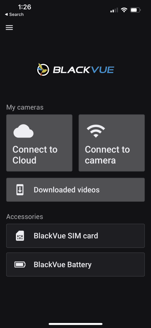
This project derived from a personal experience setting up multiple BlackVue security cameras in my car. As a customer, I wanted to easily setup my car security cameras. Unfortunately the poorly designed setup process for something simple ended up taking 45-minutes, and many frustrating visits to BlackVue’s customer service chat.
BlackVue customers are looking for a simple and quick way to setup the new dash cameras. A poor on-boarding experience leaves the customer with a bad impression.
How Might We…
Improve a user’s setup experience when first setting up connecting their BlackVue security cameras?
The Solution
I redesigned the onboarding screen to offer users a swift and seamless setup experience. This not only simplifies the process for users but also reduces the likelihood of human error, minimizes support touchpoints, and enhances the overall user experience. Additionally, it eases the workload for BlackVue’s tech support staff by streamlining the onboarding process.

Day 1
Kick Off by Empathizing and Understanding
I outlined how I would tackle the 5-day sprint and kicked off my research by empathizing with users. I reached out to 3 individuals who enjoy their BlackVue dash cameras and considered purchasing more BlackVue products.
From the interviews, I learned that users expect a simple and quick in-app experience.
User A
• Confused on how to pair the camera
• Found it “unusual” that you can setup the cameras through both “connect to cloud” or “connect to camera”
• Had to contact support to setup the cameras
User B
• Confused on how to pair the camera
• Wasn't sure how to proceed in setting up camera.
• Had to visit multiple screens before figuring it out
• Left worrying that the rest of the app was going to be awful
User C
• Confused on how to pair the camera
• Asked why the home screen showing devices he hadn’t setup yet
• Had to contact support to setup the cameras
From the interviews, I learned that users expect a simple and quick in-app experience.
User Flow Assessment
Assessing the user flow on the BlackVue mobile app helped me identify what screens, actions, and decisions a user needed to go through in order to accomplish their goal of setting up the cameras. From here, I developed a user story that would determine what the user is trying to accomplish and how they would achieve that goal in-app.
As a BlackVue customer, I want a hassle free way to setup my security cameras for the first time.

Day 2
Research and Discovery
With the problem more clearly defined, I conducted research by performing a competitive analysis and sketching possible design solutions.
Competitors: BlackVue, Nexar AI Dashcam, DVR Dash

Discoveries
Nexar AI and DVR Dash both put users into a setup flow the first time they launch the mobile app and gave customers the option to also to reset cameras they might have purchased second hand, eliminating the confusion when setting up cameras.
I found this odd that BlackVue didn’t follow expected setup design patterns. Implementing a onboarding similar to Nexar AI or DVR Dash could improve productivity and cause less customer frustration.
Mobile App Ratings and Review
Additionally, I looked into overall app reviews of BlackVue. With an average of 3.1 ratings, it is clear that the app could use some improvements. I discovered that customers are expressive about their confusion and frustrations, especially related to the UX of the initial camera setup. Based on recent updates, it looks like the mobile app is definitely a work-in-progress!

Crazy Eight Sketching Method
Assessing the user flow on the BlackVue mobile app helped me identify what screens, actions, and decisions a user needed to go through in order to accomplish their goal of setting up the cameras. From here, I developed a user story that would determine what the user is trying to accomplish and how they would achieve that goal in-app.
As a BlackVue customer, I want a hassle free way to setup my security cameras for the first time.

I generated possible solutions through sketching. I performed a quick Crazy 8’s after exploring designs online - with many mobile apps dashcam apps that had better setup methods.
A few design solutions I created included multiple screen setup. It appeared to offer a simple experience while adding in a level to handle possible complications for customers who purchased used equipment that had been paired with it’s previous owner.
Crazy 8’s is a core Design Sprint method. It is a fast sketching exercise that challenges people to sketch eight distinct ideas in eight minutes. The goal is to push beyond your first idea, frequently the least innovative, and to generate a wide variety of solutions to your challenge.
Day 4
Iterative Prototyping and User Flow Development
Wireframing mobile application with QR scan
I started off wireframing by sketching out each screen a user would interact with on the mobile app. Since the primary redesign was focused on the payment method screen, the other screens would be kept the same.
This solution not only improves the customer’s experience but also the employee’s experience as well.
Sketch/Wireframe the Flow

Low Fidelity Prototype
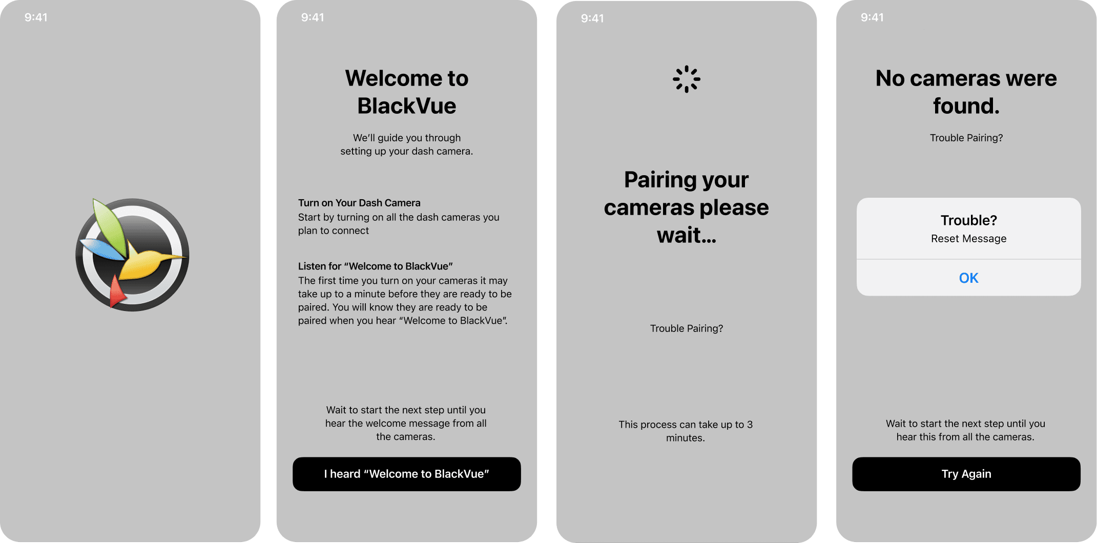
High Fidelity Prototype

Does it simplify the user experience?
After creating prototypes, I conducted 2 usability tests. I performed these tests similar to the ones in my user interviews so that I can compare and contrast analysis of the feedback the testers gave to me.
Results
• Both users had a friendlier experience with setup
• Users impression of the overall BlackVue app improved
• Users felt confident they wouldn’t need to contact BlackVue’s customer service.
Concerns and Questions
In the usability test, one of my testers asked, “How would I reset my cameras if I wanted to start over again?”
• This was a good question! When brainstorming a solution, I had thought about this. My original thought was to allow a secondary button with “Reset up Existing Cameras” However, a better solution to this could be to explain to hold in the power button for 30 seconds if they had issues pairing.
Day 5
Review Feedback and Final Revisions
On the final day of the design sprint, I took some time to review feedback and made final revisions.
I looked over the How Might We statement again to make sure that the design solution I choose to prototype, would generate a simpler solution for the user.
While there are many variations to first time setup, it was important to consider the overall experience a user would have. This meant referring back to my user interviews which indicated a decent overall experience that just needed improvement on one particular issue of onboarding.
Usability Feedback:
A user indicated he was looking for a “reset” option for existing cameras.
This got me thinking… Would a user’s experience improve by showing a “trouble pairing?” or help icon on “Please wait” screen? So I went back to the drawing board and created a new link for trouble pairing. This gave the user a quick message that explained how to reset the cameras by holding in the power button for 30 seconds.
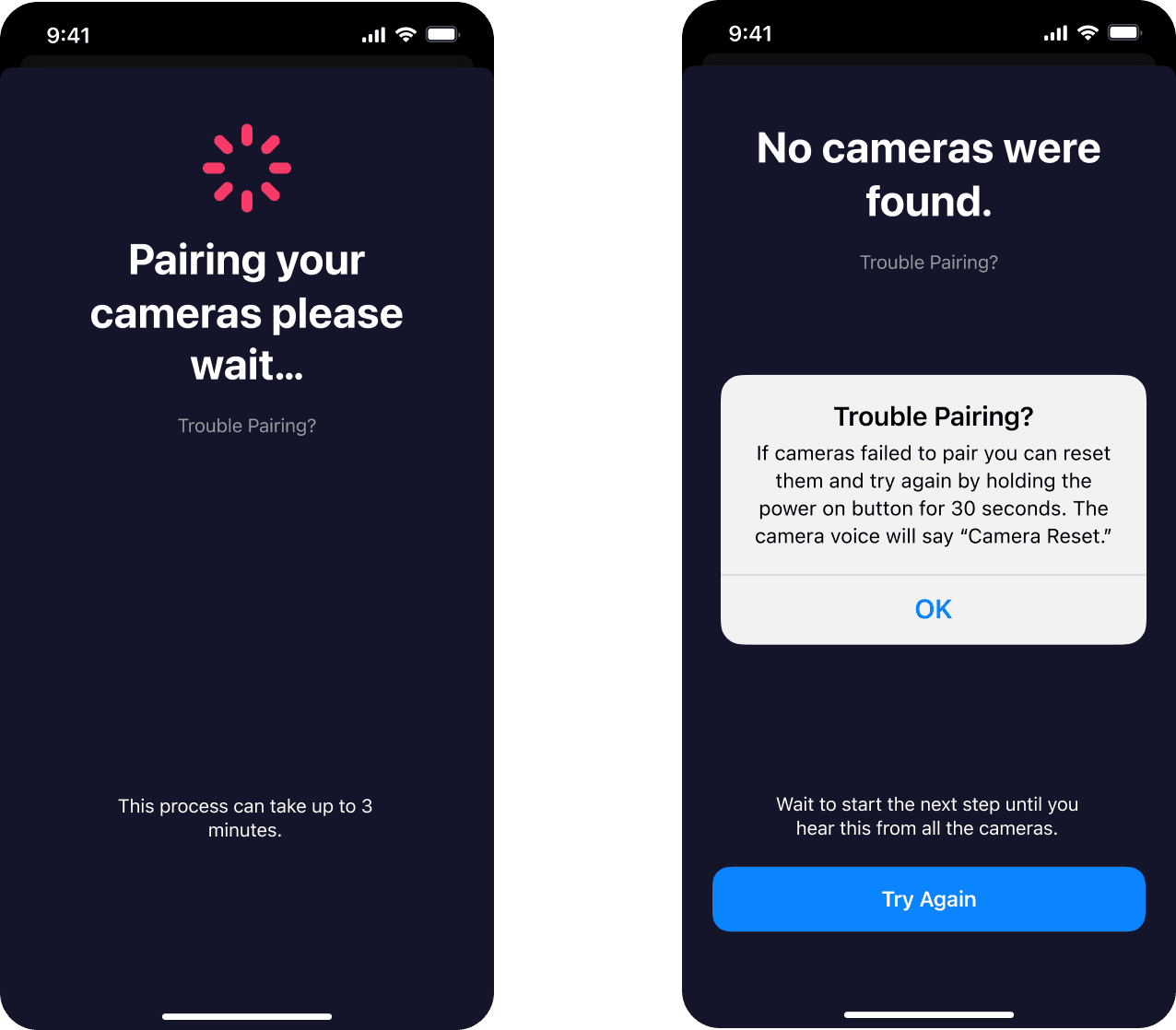
Now that a user has two possible paths to accomplish their goal, I revisited the user flows I developed another pathway to illustrate the user’s journey.
As a BlackVue customer, I want a hassle free way to setup my security cameras for the first time or reset existing ones.

Impact and Benefits
User Satisfaction
Users are more inclined to perceive BlackVue’s brand better because of ease of use.
Increased User Purchase Rates
Satisfied customers will purchase more products from BlackVue
Decreased Customer Support
Reduction in the number of customer touchpoints and the cost of customer service.
Increased Productivity
Users spend less time completing tasks due to intuitive design.
Takeaways
Challenges
• Having testers lined up in advance is really helpful when doing usability tests. With the challenge of designing a prototype in 5 days, I didn’t allow myself as much time as I wanted to on my research.
• I discovered there were layers to resolving this problem, such as thinking about what a user’s experience would be if they purchased used cameras or added additional new ones.
Thinking Ahead
• Diving into the app as a whole and uncovering the needs of the users with the setup features. From the research I gathered it was clear I didn’t think about used camera purchases or setting up additional cameras later
Additional Case Studies

